
Designing a Clearer Path to Eco-Action with EarthMera
UX/UI Design Collaborator (2025)
EarthMera is an eco-action platform built to encourage sustainable behaviors through community participation and mission-based engagement. As a UX/UI Design Collaborator, I worked closely with the CEO, designer, and engineer to support product refinement and contribute to key experience improvements across core user flows.

Character-focused controls and an inconsistent check-in UI diluted EarthMera’s eco-action core, prompting a shift to automatic check-in and action-driven flow.
Unclear navigation and inconsistent visual hierarchy
The initial experience focused heavily on playful, character-driven visuals, but this often overshadowed the platform’s core eco-missions. Users struggled to quickly identify actionable steps, track progress, or understand how their actions connected to broader environmental goals. While visually rich, the experience felt fragmented and lacked a clear sense of guidance.
Re-centering the experience around clarity and purpose
• Shifted the focus from character-centric visuals to clearer eco-action pathways aligned with user intent
• Reworked layout and hierarchy across key screens including Home, Profile, Sign-in, and Setup
• Simplified navigation and content structure to support more intuitive user movement
• Strengthened visual consistency through refined spacing, typography, and component usage
• Transformed eco-actions into clearer, step-by-step interactions supported by prompts and progress feedback
BEFORE


>
AFTER

Removed redundant ZIGU links and restructured the profile menu to spotlight user identity, activity, and eco-impact.
BEFORE

>
AFTER

A more guided and action-oriented experience
The refined structure helped users more easily understand how to start, stay engaged, and follow through on eco-actions with confidence. By bringing clarity to the experience, the platform felt more purposeful, approachable, and aligned with its environmental mission.

Ticketeer is an eco-action app developed by EarthMera and provided for the UKIS 2025 event, enabling attendees to take sustainable actions, engage with booths, and complete missions within the live event environment.

BEFORE

AFTER

BEFORE

AFTER

>
>
Added a QR upload option at sign-in to streamline event entry and create a faster, more intuitive user flow.
Separated vendor and mission tasks into two clearer pages, renamed the vague “Lounge” label for clarity, and added a map button so attendees could quickly locate booths.
Disconnected structure and inconsistent flow
Several elements in the interface did not align with how attendees navigated and used the app during the event. The “Lounge” label lacked clarity, vendor discovery and mission tasks were combined into a single flow, and the map felt disconnected from booth browsing where spatial context mattered most. Inconsistent logo proportions further weakened visual cohesion across screens.
Reshaping the structure to reflect real attendee flow
• Clarified the purpose of the ambiguous “Lounge” section, renaming it to better match attendee behavior and expectations
• Reorganized vendor discovery and eco-action tasks into clearer, purpose-driven pathways aligned with real event movement
• Introduced a contextual map button within booth listings, allowing users to instantly locate vendors in physical space
• Proposed and implemented QR upload access directly on the sign-in screen to streamline entry
• Refined navigation hierarchy and visual consistency to support smoother movement and reinforce brand coherence across screens

A more focused and responsive event experience
The updated structure enabled users to quickly understand where to begin, how to locate booths, and how to complete eco-actions without unnecessary confusion. By clarifying intent and simplifying interaction paths, Ticketeer became a more intuitive and supportive eco-action experience within the UKIS event environment.
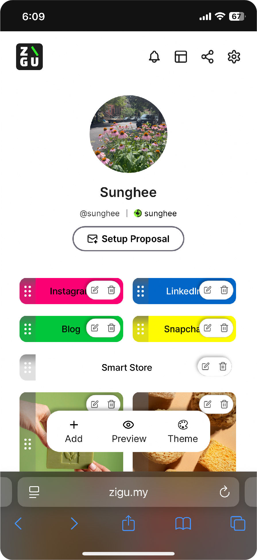
ZIGU is a widget-based link-in-bio tool developed by EarthMera, designed to help users curate and organize sustainability-related content, social links, and action-driven resources in one flexible interface.

BEFORE

AFTER

BEFORE

AFTER

>
>
Key areas of the interface felt visually heavy and structurally unbalanced. Profile information lacked clear hierarchy, UI elements competed for attention due to inconsistent styling, and the widget setup flow did not clearly support how users choose and configure widget formats.
• Repositioned profile identity elements to strengthen hierarchy and restore visual balance
• Reduced shadow intensity to minimize visual noise and modernize the interface
• Removed Schedule from the “New Widget” page and restructured the layout around widget content types
• Strengthened the Schedule page by introducing a clearer and more intuitive widget size selection experience
• Unified button styles and visual elements to reinforce consistency across screens

The updated structure created a clearer sense of direction within the widget flow, allowing users to identify content types, customize layouts, and make choices with greater confidence. By improving structural logic and visual consistency, ZIGU now supports a more scalable and user-centered foundation for future content expansion.

Bringing structure and clarity to the widget experience
Layout imbalance and interaction ambiguity
The experience now feels lighter, more intentional, and visually cohesive
Strengthened hierarchy and cleaned up the profile layout for better clarity.
Restructured the widget menu and improved the size-section UI for a more intuitive setup experience.


Elevating Communication and Brand Consistency for TOEFL
Digital Content Visual Designer (2025)
Created social media and marketing assets for TOEFL Korea, a global English-education brand, refining layout, typography, and color systems to maintain global brand consistency. Collaborated closely with the Marketing Director to translate key messages into clear, engaging visuals optimized for digital platforms.


